Page 8 of 10
Designer Brews
Diving into the look of 5 soon-to-be iconic brews.
By Ray Howze
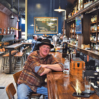
Breweries are hip these days. That shouldn't be a surprise to anyone, especially if you see someone around Salt Lake City wearing swag from one of the area's newest brewhouses. But the logos they parade involved some careful thought—and even a few trips back to the drawing board.
Here's a look at five Salt Lake City brewing operations and some insights into why their emblems look the way they do:

1. Roha Brewing Project
The folks at Roha Brewing Project (30 E. Kensington Ave., 385-227-8982, rohabrewing.com) deal in cans, and wanted to create something with an "outdoorsy feel," according to co-owner Rob Phillips.
But they also had and education-based focus—teaching consumers about its brews—and pushed for a design that involved both.
"We started with this concept of a scientific, hexagon shape that represented the alcohol chemical build, and it looked way complex and confusing," Phillips says. "But it had this hexagon shape in it and we thought, 'Hey, we kind of like that.'"
As a result, Roha ended up with its tree-like logo placed inside a hexagon that wraps on the can nicely. Phillips says they had a number of other options, including one reminiscent of REI's logo, but wanted something simple and a design that could eventually stand on its own.
"Someday, as our brand develops and grows, that symbol alone will represent Roha," he says. "We wanted that simplicity."

2. Kiitos Brewing
Speaking of logos that can stand on their own, Kiitos Brewing (608 W. 700 South, 801-215-9165, kiitosbrewing.com) and its president, Andrew Dasenbrock, have developed one of the area's most recognizable designs—the blue circle with a "K" inside.
The symbol invokes a look and color scheme similar to the Finnish flag—Dasenbrock's family emigrated from Finland—and it was almost immediately noticed when the company opened in 2017. As Dasenbrock tells City Weekly, his brewing operation wasn't even open a week when he walked into a bar in Park City wearing a hat emblazoned with the logo and a customer asked if he was with Kiitos.
At that point, he says he knew they found something that worked. But it wasn't easy getting to that point, despite how simple the brand might appear. In the company's initial stages, Dasenbrock and others spent nearly 100 hours poring over various looks, crossing off some and circling others they liked. They even considered a rendition of the stonework on the outside of Helsinki's train station, but eventually, settled on the "K."
"I'm a logical person, I like ones and zeros," Dasenbrock says. "And I'm not that great at [design], but we did some mild tweaking on it and I've been in love with it ever since."
If you've noticed some animals on Kiitos' cans, those are creatures found in Finland, including endangered ones such as the Saimaa Ringed Seal. Dasenbrock hopes to eventually partner with a wildlife conservation group.
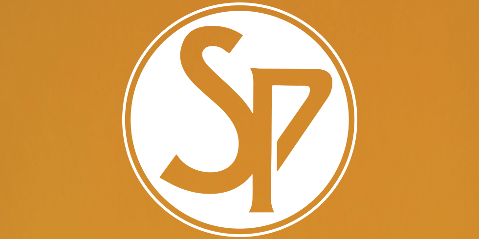
3. Shades of Pale Brewery
Shades of Pale Brewery (154 W. Utopia Ave., 435-200-3009, shadesofpale.com) has been around for nearly a decade, so it's no surprise the company's logo is familiar to many Utahns. But that doesn't mean is can't use an update. General manager Adam Wiggins says they're currently undergoing a rebrand they hope to fully unveil next year.
While some plans are still fluid, one change customers might notice moving forward is more emphasis on the word "Shades" instead of its full name. "One word is always better than two. But that won't get lost on them [the customer]. We are always Shades of Pale," Wiggins says.
Shades of Pale still will package its beer in bottles, but instead of the "SP" logo, you might start seeing just the "S" along with Shades Brewing. The company's bottle labels can range from intricate, old-timey art to a more-simple logo and text. They even used to put trail maps on labels but have shied away from that in recent years. But whatever they settle on next, don't expect their beer mission to change.
"We are taking some classic recipes and adding some twists to it—a whimsical flair to it, if you will," Wiggins says. "Our head brewer is a microbiologist that allows us to do that."
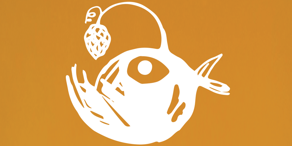
4. SaltFire Brewing Co.
Have you noticed the angler fish on SaltFire Brewing Co.'s (2199 S. West Temple, 801-661-1947, saltfirebrewing.com) bottles? Chances are you have, but look a little closer and you'll see a hop dangling in front of it.
That's just one of the details SaltFire owner Ryan Miller says he loves about the debut look. The newly opened brewery in South Salt Lake has added some flair to the brewing scene with its bottle labels and angler fish.
However, SaltFire almost wasn't SaltFire. Miller says he had a few names in mind, but some were already taken by other breweries around the country.
"Finding a name for your brewery or your beers especially is so hard," Miller says. "They're all taken and copyrighted."
After a lot of "going back and forth" on designs and names, Miller says it was "really helpful to have a lot of people to bounce ideas off of and take the criticism." Eventually, he says, he just had to settle on one—and it's since grown on him. When it came to the actual name, he says it not only originated from the city's name, but from other practices, such as a method of firing pottery known as salt firing.
"You can put the pottery in the kiln and then you throw salt in there and it creates some really fantastic colors on the pottery," he says.
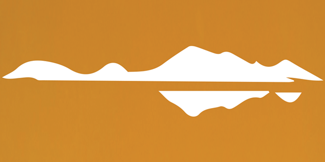
5. Salt Flats Brewing
If you aren't too familiar with Salt Flats Brewing (saltflatsbeer.com), that might be because the company changed its name from its original RPM Brewing in May. As a brewing company with close ties to the racing world—and particularly, the Bonneville Salt Flats—operations director Jeremy Ford says they wanted to create a new brand that had a stronger local connection.
"The actual logo is supposed to be very simplistic of the reflection of the Salt Flats," Ford says. "The colors are white and black because that's what you see when you're looking out at the Salt Flats."
As RPM Brewing, they mostly operated out of the Garage Grill in Draper, but decided they wanted to get in the distribution business as well. Currently, they have a minimalistic black-and-white logo.
Ford, though, says it might morph a bit soon as they work on a complete branding overhaul. The initial design, he says, was something put together in a "quick, two-week process." They also want to stay connected to their automotive history. Salt Flats' owners previously operated a race team and still own a race car they can drive on the Salt Flats.
"We want to connect a little of our automotive heritage to the local Salt Flats market," he says. "And to emphasize the surroundings we have—a lot of people tend to look east instead of west and there's a lot of cool stuff out there."