From grabbing your favorite local beer off the shelf to responsibly disposing the bottle in a recycling bin, you might not give much conscious attention to the images on your bottle of suds. But the process for creating the look of a beer's label presents a particular challenge combining the talents of artists with the savvy of business marketing.
According to Jeremy Ragonese, chief marketing officer for Uinta Brewing Co., that process involves a combination of maintaining a certain consistency in the style of the company's products, while also attempting to identify for consumers what makes a new product unique. "Ultimately, Uinta has a distinctive style that we've used visually to identify our beers on the shelf," Ragonese says. "We try to remain as consistent as we can, so Uinta beer stands out to a Uinta consumer. But ultimately that visual style is an element of storytelling. We're trying to hone in on ... helping the consumer identify what the taste profile might be; we may be picking something that is inspired by a particular region or location."
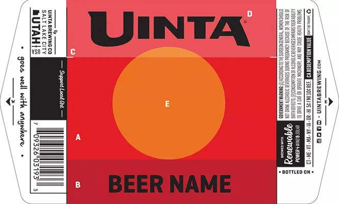
The target end result can take a variety of different forms depending on the type of product that's being launched. For the core line of products, Ragonese says, much of the work is done by an in-house design team, creating a general concept that might then be sent to an outside agency for fine-tuning. Sometimes the graphic design can be simple typeface, as in the case of Uinta's 801 pilsner.
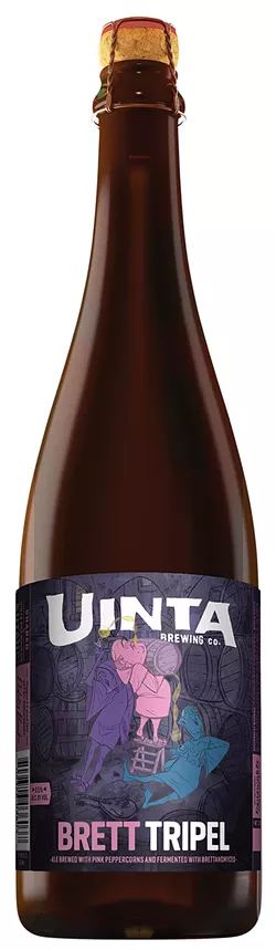
Then there are cases like annual small-batch brews, where the company allows artists the opportunity to introduce a bit more of their own distinctive style. In 2016, Uinta introduced the Belgian-style Brett Tripel ale as one of these specialty brews. According to Jake Hill, part of the Uinta graphic design team, "We have a list of Salt Lake local artists, respected in the community, whose work we enjoy. When we come up with a new beer, we might approach them with something in mind that kind of fits their art style, then pair it up."
For the Brett Tripel Ale, that artist choice was Robin Banks, whose style—a Disney-like style of cartoon illustration—offered the kind of playfulness Uinta was looking for. "I think they were kind of sitting on me until they came to a character-driven thing," Banks, this issue's own cover artist, says. "They came up with the idea of the drunk Belgian monks, and thought that I could make it funny but also classy."
Not surprisingly, the process of an artist working with a business presents some unique dynamics. While Banks had a lot of experience doing commissioned work involving, for example, record covers, "there's a lot of back-and-forth with a larger company like Uinta," they say. "They've got to be specific about what fits their image. There's an adjustment period where you've got to go back and change some things. It was all pretty laid-back, but at the end of the day, has to work for them."
In the case of the Brett Tripel label, Banks received some general guidelines to shape the design, based on a "mood board" created by the in-house Uinta design team. The company said that there could be one and three monks in the illustration; "I thought three worked best for the 'Tripel,'" Banks says. Ultimately, the artist presented a few concepts, and Uinta ultimately went with the one that was Banks' favorite. "From there it didn't change much," Banks says. "I think in the end, the most real tweaking I had to do was on the colors."
The result is a work as vibrant and singular as any piece of art hanging on a gallery wall—and according to Ragonese, Uinta customers treat it that way. The company sold signed and numbered limited edition prints of the label art from its recent Birthday Suit series, and often gets requests from visitors to the retail location about how to get representations of the label art. "People are always clamoring for either shirts or signage, or glassware," Ragonese says. "We know there's a great response to the Uinta visual identity."
That visual identity is always a goal for a company trying to make its products stand out in a crowded marketplace—and that's part of what makes creating a product label such an artistic task. While it might not be enjoyed on a gallery wall by visitors who linger over its details, works like Banks' Tripel label still makes an impression. "We only get a couple of seconds for a consumer to decide if they find a package attractive or persuasive on the retail shelf," Ragonese says, "and we have to say a lot in a very short time frame. People are attracted to something that is not only visually appealing, but is going to convey the flavor profile of that particular beer, and hopefully earn that opportunity for people to sample us."
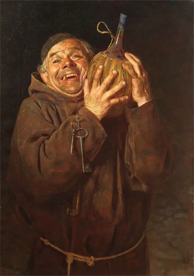
It's not every work of art that has to make you want to crack open and try what's inside.